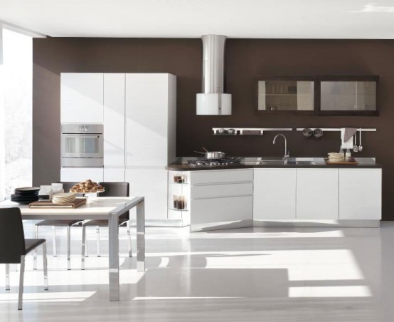
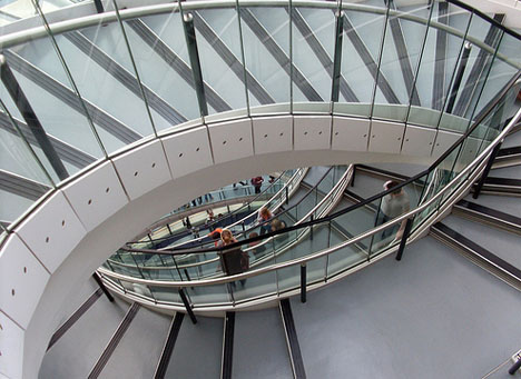
So I was asked to finish what I started and do a post about "Asymmetry." I do what I'm told. Asymmetry in decorating is easier for me. It's not better, just a little easier for me to pull off. But, harder for me to explain. You'd think asymmetry would be more difficult to pull off in decorating, but if you are going for a symmetrical decorating scheme you'd better get it right or things will look ever so contrived. In nature, as mentioned in the "symmetry" post, many things are symmetrical upon close inspection but pulling back to the bigger picture there is a lot of asymmetry. A lot! So the details are meticulously thought out but the bigger view has an ease about it. Isn't that interesting? I could talk about this stuff all day! (I'm sure it is a yawn to most!) Asymmetry, done correctly, tells you a story about the people that live in the room. It looks put together over time. Make sense? Look at the photos and see if you catch my meaning. I find a calm in asymmetry that another might deem "chaos." Asymmetrical decorating is often called "decorating with the eye." It's sort of unquantifiable. I love both asymmetry and symmetry. Like nature, there is a need for both in decorating. It fills out your space to have both done correctly and tells your story in an interesting way.


1 comments:
It certainly brings for a more visually interesting experience. :-)
-French Bean
Post a Comment
I SO enjoy your comments! Please make my day by saying "Hi!"